Recent projects

Every Project, One Place

Filter by the kind of business. Most sites open in a new tab so you can see the real thing, not a mock-up. Prefer a visual browse? See the gallery →

Whiskers Care Company website
Pet care · Pasadena, CA

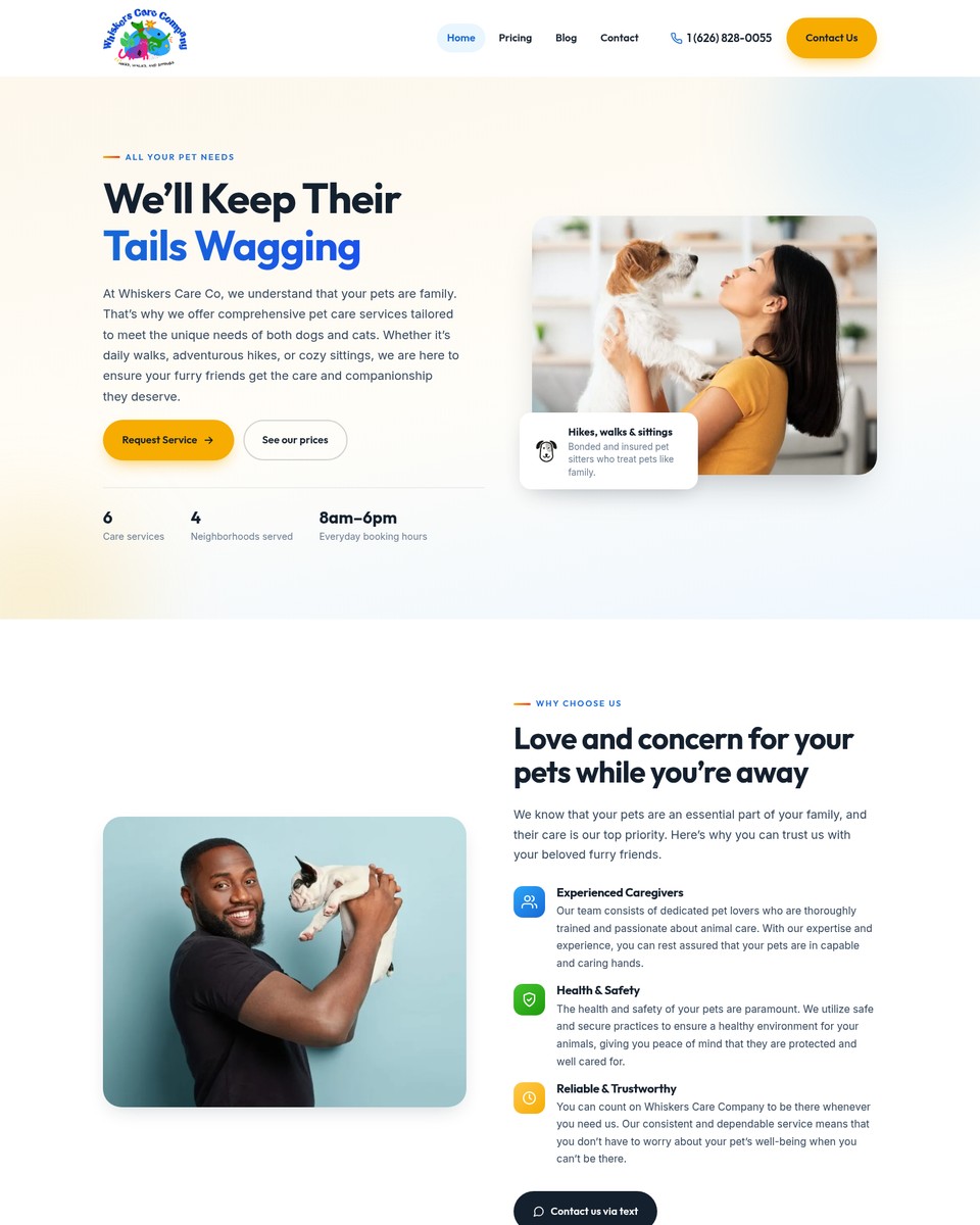
Whiskers Care Company

Six services, each with its own page and starting price, for a dog-walking and sitting company serving four neighbourhoods.

Web design · Local SEOVisit site

Goodwin Greenhouse website
Garden center · La Grange, KY

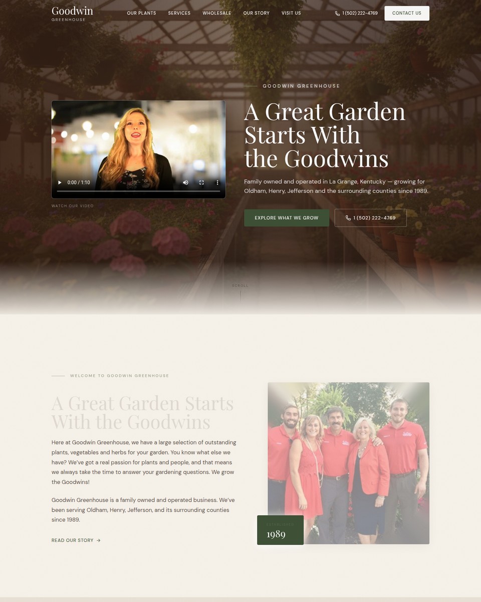
Goodwin Greenhouse

A story-led site for a family greenhouse growing since 1989 — plants, wholesale and a reason to visit.
Web design · BrandVisit site
Vic’s Auto Clinic website
Auto repair · Glendale / La Crescenta, CA

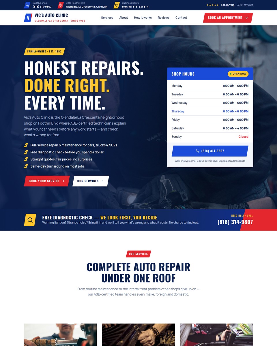
Vic’s Auto Clinic

Honest repairs, done right: a phone-first site for a family-owned ASE-certified shop on Foothill Blvd since 1992.
Web design · Local SEOVisit site
DRN Health & Wellness website
Medical clinic · St. Louis Park, MN

DRN Health & Wellness

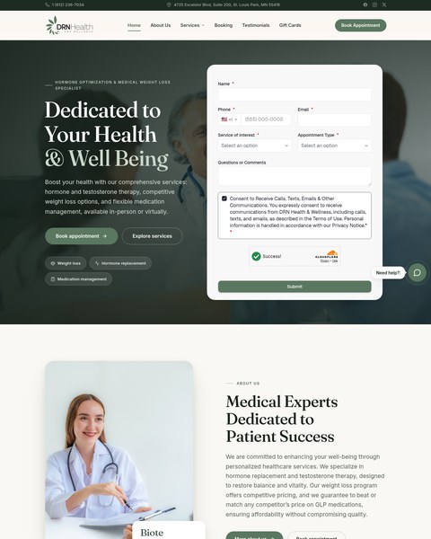
A booking form above the fold for a hormone-optimisation and weight-loss clinic that competes on price and trust.

Web design · Booking · Lead captureVisit site
1-855-GOTLawyer website
Personal injury · 24/7 hotline

1-855-GOTLawyer

A phone-first injury site built to turn paid and organic search into free case evaluations.
Web design · Landing pagesVisit site
LeadSys website
Lead generation · B2B

LeadSys

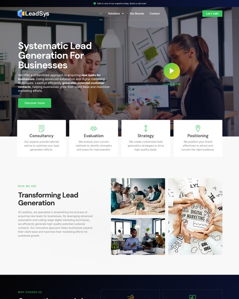
A dark, confident site that explains a systematic lead-generation process in four steps.
Web design · BrandVisit site
Pixport website
Field-service software

Pixport

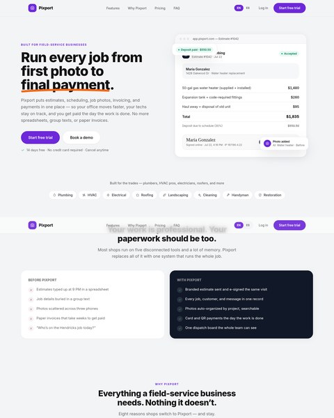
Marketing site for job-management software — from first photo to final payment.
Web design · Product marketingVisit site
SureForm website
Form builder · SaaS

SureForm

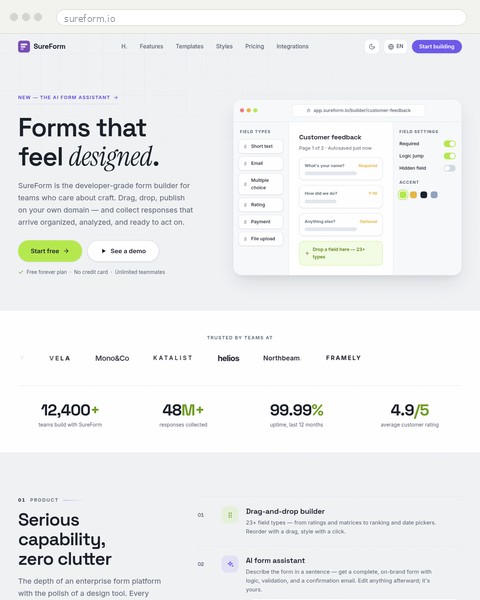
Product site for a form builder, with the forms themselves doing the persuading.
Web design · Product marketingVisit site
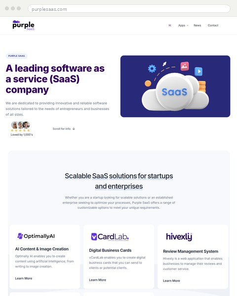
Purple SaaS website
SaaS company

Purple SaaS

Corporate site for a software group — scalable SaaS for startups and enterprises.
Web designPrivate project
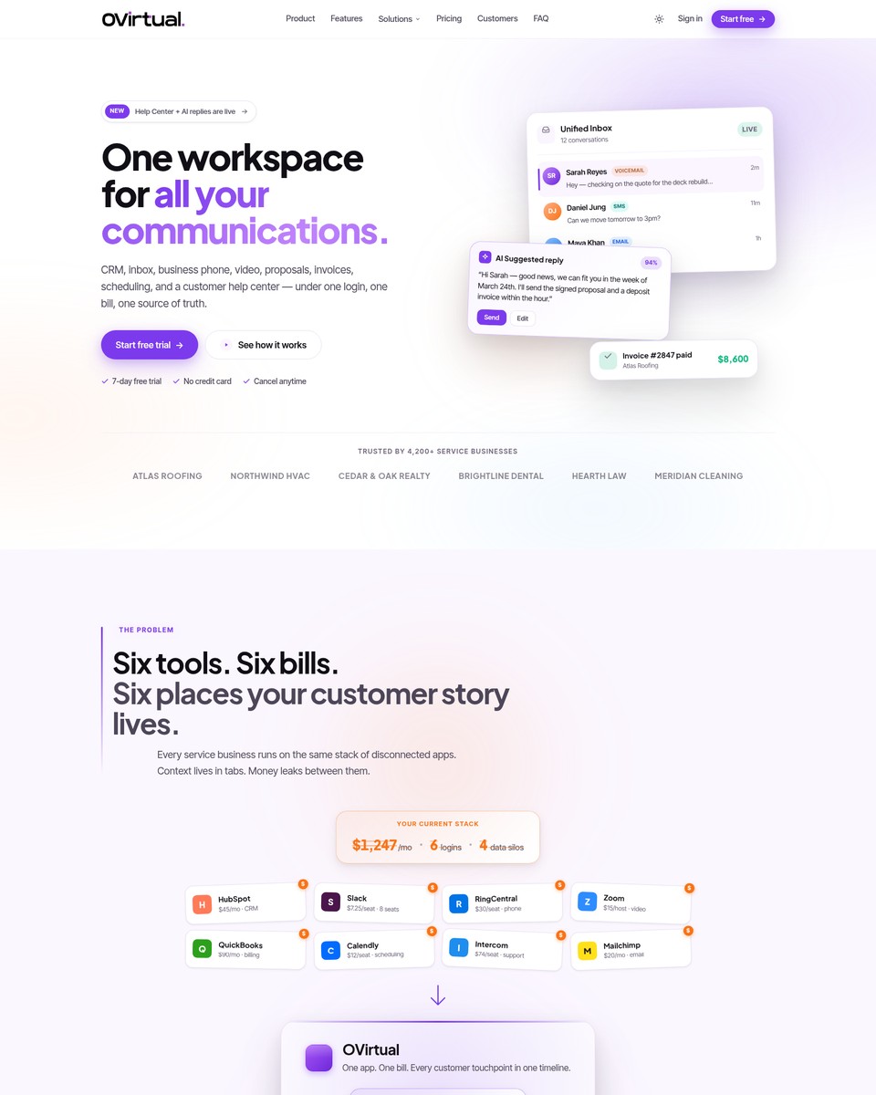
OVirtual website
Business communications

OVirtual

One workspace for calls, texts and video — a site that makes a complex product feel simple.
Web design · Product marketingVisit site
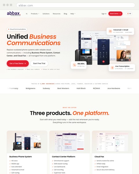
Abbax website
Cloud telecom

Abbax

Three products, one platform: unified business communications explained without the jargon.
Web design · Product marketingVisit site
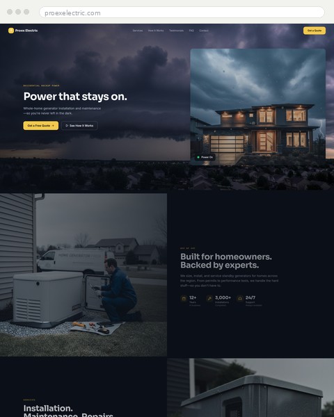
Proex Electric website
Generator installation

Proex Electric

Power that stays on — a lead-generation site for a residential generator installer.
Web design · Local SEOPrivate project
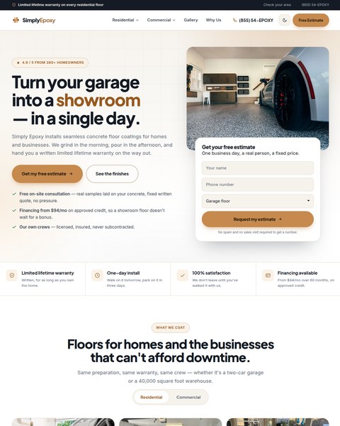
Simply Epoxy website
Garage floor coatings

Simply Epoxy

Turn your garage into a showroom in a single day — quote-first design for a coatings crew.
Web design · Local SEOVisit site
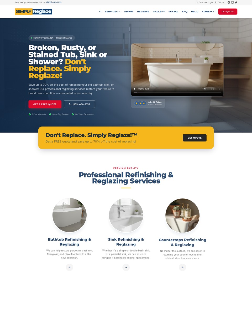
Simply Reglaze website
Bathtub refinishing

Simply Reglaze

Don’t replace, reglaze: a before-and-after driven site with a clear quote path.
Web design · Local SEOVisit site
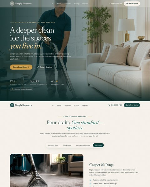
Simply Steamers website
Deep cleaning

Simply Steamers

A deeper clean for the spaces you live in — booking-led site for a cleaning company.

Web design · Local SEOVisit site
In detail

Nine Projects, Up Close

The brief, what we built, and what changed — in the client’s terms, not ours.

Whiskers Care Company website
Pet care · Pasadena, CA

Whiskers Care Company

Services
Web design, local SEO

The brief

A dog-walking and pet-sitting company with loyal customers in South Pasadena, Highland Park, San Marino and Arcadia — and a website that didn’t tell new ones what it cost or how to book.

What we built

  • A page for each of six services — puppy sitting, dog walking, pet sitting, overnight care, vacation drop-ins and dog hiking — each with a starting price and a direct booking link
  • A neighbourhood coverage callout so local searchers know instantly they’re in the service area
  • “Why choose us” built around the three things pet owners actually worry about: experience, safety and reliability
  • Warm, friendly brand palette and photography of real pets and people, not stock dogs

What changed

Visitors can see the service, the price and the next step without a phone call first. Every service page is a landing page for the neighbourhood search that produced it.

Goodwin Greenhouse website
Garden center · La Grange, KY

Goodwin Greenhouse

Services
Web design, brand refresh

The brief

A family greenhouse growing for Oldham, Henry and Jefferson counties since 1989, with a reputation that far outran anything it had online.

What we built

  • A cinematic hero with the family’s own video and a story-led headline: a great garden starts with the Goodwins
  • Plant categories — spring annuals, vegetables and herbs, seasonal plants — presented as a browsable collection
  • A wholesale section for trade customers and clear visit-us information
  • Serif typography and an earthy palette that matches walking into the greenhouse

What changed

The site finally feels like the place. Customers arrive knowing what’s in season, and trade buyers have a page written for them.

DRN Health & Wellness website
Medical clinic · St. Louis Park, MN

DRN Health & Wellness

Services
Web design, booking, lead capture

The brief

A hormone-optimisation and medical weight-loss clinic that competes on price-matching and personal care — and needed appointments, not just visits.

What we built

  • A booking request form above the fold with service-of-interest and appointment-type selectors, consent language and spam protection
  • Service chips and a certification callout (Biote provider) to establish trust in the first screen
  • A stats band and “care built around your goals” programme section for the second read
  • A “Need help?” prompt and chat bubble for visitors who’d rather ask than fill in a form

What changed

Booking is the first thing on the page instead of the last. Enquiries arrive structured — service, appointment type, contact — so the front desk can act on them immediately.

1-855-GOTLawyer website
Personal injury · 24/7 hotline

1-855-GOTLawyer

Services
Web design, landing pages

The brief

A round-the-clock injury hotline that connects callers with participating attorneys, competing in one of the most expensive search categories there is.

What we built

  • A bold, phone-first hero: the number, the promise, and a free case evaluation button — nothing else competing for attention
  • A three-step “how it works” section that removes the fear of calling
  • A Google reviews badge placed right after the process, where trust matters most
  • A practice-area carousel — car accidents, medical malpractice, slip and fall, personal injury — each one a landing page for paid search

What changed

Every visitor, from every campaign, sees one clear action. The page structure doubles as a landing-page system for PPC.

LeadSys website
Lead generation · B2B

LeadSys

Services
Web design, brand

The brief

A B2B lead-generation company selling a systematic process — which is hard to show on a website without it reading like a brochure.

What we built

  • A dark, confident hero with a “learn more” video and a plain-English promise
  • The four-step framework — consultancy, evaluation, strategy, positioning — as cards visitors can scan in seconds
  • A “connecting people is our business” section that turns the mission into four concrete capabilities
  • A stats band and a persistent “let’s talk” CTA

What changed

Prospects understand the process before the first call, so sales conversations start further along.

Simply Reglaze website
Bathtub refinishing · Home services

Simply Reglaze

Services
Web design, local SEO

The brief

A refinishing crew whose whole pitch is one sentence — don’t replace it, reglaze it — competing against remodelers who charge ten times as much and search results that don’t know the service exists.

What we built

  • A headline that names the problem exactly as homeowners describe it: broken, rusty or stained tub, sink or shower
  • The “Don’t replace. Simply reglaze.” promise as a persistent band with a quote button, so the offer travels down the page
  • A page per surface — bathtubs, sinks, showers, tile and countertops — each written for the search that finds it
  • Before-and-after photography doing the persuading, with the quote form never more than a scroll away

What changed

The site sells the category, not just the company. Visitors who didn’t know reglazing was an option arrive, understand it in one screen, and request a quote.

Abbax website
Cloud telecom · Unified communications

Abbax

Services
Web design, product marketing
Live site
abbax.com ↗

The brief

A cloud communications provider with three products — business phone, contact center and cloud fax — and a website that read like a spec sheet to the office managers actually buying it.

What we built

  • One promise up top: replace outdated phone systems with reliable cloud communications, managed from one platform
  • Two paths from the first screen — a free demo for buyers who want a conversation, a free trial for those who’d rather try it
  • Feature callouts shown as things you’d actually use: voicemail to email, live transcription, uptime you can quote to your boss
  • A trust strip of the industries and brands already on the platform, and a “three products, one platform” section for the second read

What changed

A technical product explained in the buyer’s language. Demo and trial requests arrive from people who already understand what they’re getting.

OVirtual website
Business communications · SaaS

OVirtual

Services
Web design, product marketing

The brief

A platform that bundles CRM, inbox, business phone, video, proposals, invoices, scheduling and a help center for service businesses — which is a lot to say without losing the reader.

What we built

  • A single headline that reframes the category: one workspace for all your communications — one login, one bill, one source of truth
  • The pain named before the product: six tools, six bills, six places your customer story lives
  • Start-free-trial as the primary action with the objections answered beside it — free trial, no credit card, cancel anytime
  • Product screens shown in context so each capability is seen, not listed, and a trust strip of service businesses already using it

What changed

Prospects grasp the “one workspace” idea in the first screen instead of the fifth. Trials start from understanding, not curiosity.

Vic’s Auto Clinic website
Auto repair · Glendale / La Crescenta, CA

Vic’s Auto Clinic

Services
Web design, local SEO

The brief

A family-owned, ASE-certified repair shop that has been on the same stretch of Foothill Blvd since 1992 — trusted by everyone who has been in, and invisible to everyone searching “mechanic near me” at 7am with a warning light on.

What we built

  • A hero that leads with the promise — honest repairs, done right, every time — beside a shop-hours card with today highlighted and a tap-to-call number
  • A “free diagnostic check” band right under the hero, because the first objection is always “what will it cost to find out?”
  • Nine service pages behind a scannable grid — brakes, diagnostics, oil changes, A/C, transmission, electrical, exhaust, tires, steering — each with a call-to-book
  • “More than a garage — a crew that explains” story section, ASE badges, a four-step “simple, transparent, fast” process and a makes-we-service strip
  • Real Google and Yelp reviews pulled onto the page, and a come-by section with map, address and hours

What changed

The site does what the front counter does: says what’s wrong, what it costs to find out, and when you can come in — before anyone has to call. Every service is its own page for the search that produces it, and the phone number is one tap away on every screen.

Want yours on this page next year?

Phone number(800) 519-0018
What you get back
A straight answer on whether we can help, what it would take, and roughly what it costs — no pressure either way.

Start a conversation